The anatomy of a Facebook ad
If you look up “anatomy” in a dictionary, you’ll find out exactly what it means. You will be informed that it refers to the study of a thing’s interior structure or functioning. You’ll learn about the “structure” and “internal workings” of Facebook jewelry ads in this post, which are what make them such successful forms of advertising.
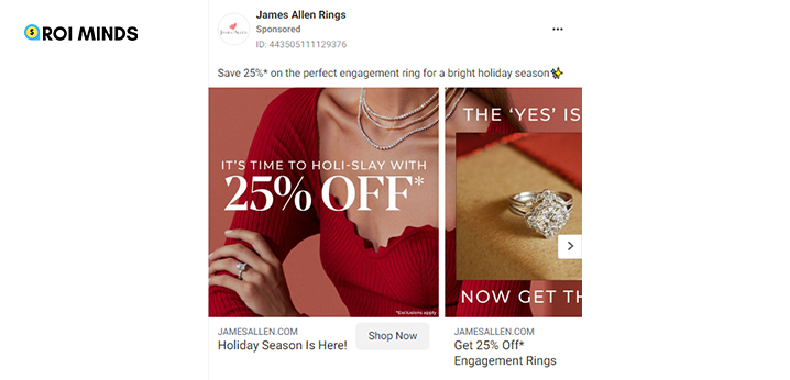
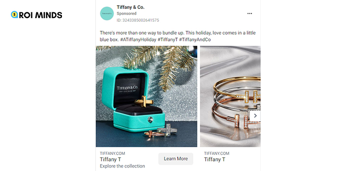
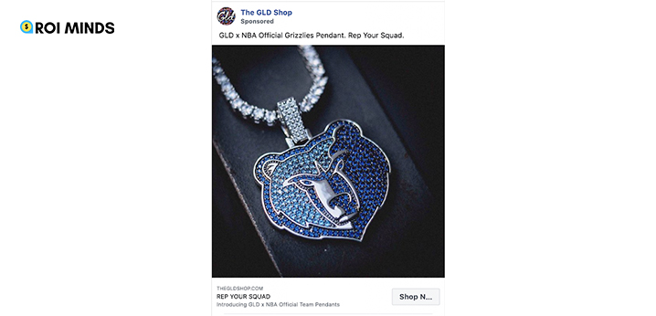
The components of a typical Facebook advertisement are as follows:
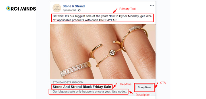
- Primary Text
You are aware of the influence your written language and the creative components positioned beneath it have, whether you work in the advertising industry or not. The term “post-text” also refers to the main body of text in a Facebook advertisement. There are various Facebook ad types, and depending on the type, an ad may have a single line, one or more paragraphs, or numerous lines of copy.
You are limited to 125 characters in your main text section. Because this is the largest text area you’ll have, utilize it wisely.
To determine the length that works best for their Facebook ad campaigns, advertisers conduct a lot of testing. While other audiences prefer paragraphs in the post-text field, some audiences respond better to single-line post texts.
Emojis are frequently used in advertisements to accentuate, convey, and spice up the main text. If emojis fit the tone of your company, you should use them in your advertisements as they are excellent attention-getters.
But don’t worry. When contemplating the composition of a Facebook ad, there is more than just the post text to consider. It’s best to spread out your Facebook advertising efforts.
- Creative
For a reason, we warned you not to put all your eggs in one basket. It’s because text takes longer for our brain to process than visual information. Even if your post text is the most brilliant thing you’ve ever written, it won’t be creating the engagement and ROI you’re after without a perfect ad image or video to support it.
You should therefore strive to make it as alluring as you can without coming across as intrusive. Of course, you want to use the most stunning and captivating creative in your campaign, but there are several things to take into account to ensure that it blends in seamlessly with the rest of the ad.
You should be aware of what your audience wants to see and the message you want your ad image to portray in order to make sure the creative aspect you’re adding to your advertising campaign hits the mark. Knowing your audience helps you understand what will interest them. Once you have that, you can move on to making sure the creative exudes the value the client is seeking.
How can you ensure that you maintain a firm hold on their attention at this point? Ensure excellence. Make it a point to only publish creative aspects that don’t scream poor image quality, such as those that are blurry, grainy, too dark, or too bright. For instance, it is advised to use an image with a minimum resolution of 1080×1080 pixels for the majority of positions.
An excellent technique to increase engagement and CTR is by using video creatives. When adding videos, you should think about their length, quality, and compatibility with your advertising goals. Will a brief, medium-length, or lengthy video be enough to convey your message or too much? Here’s how to make sure your video advertisements have the ability to convert.
- Headline
We’ll pay additional attention to headline writing because it’s one of the components in the anatomy of a jewelry Facebook ad that will do a lot of the persuading. The headline of your advertisement is often placed underneath your creativity. Engagement will be sparked by the larger and bolder line of text immediately below.
In a single line of text, great headlines incorporate creativity, urgency, and CTAs. Although one sentence may seem like a lot of work, you should realize that it will draw viewers’ attention because it is the line of text that is most noticeable within your ad.
This line of text needs to convey the value your product can offer, which shouldn’t be difficult if you know what value you can offer to your target buyers. A headline must be concise, unambiguous, and attention-grabbing in contrast to post-text. You should use a single line to elicit creativity, interest, and subsequent action. Emojis can help you stand out and add attitude to your communication.
Grasp their interest and make sure to guide them toward clicking your CTA button. Emojis, that point at your magic button, can be used, or you can compose a headline that complements your CTA button. You will be able to secure clicks with those items.
- Link Description
The description appears directly beneath your Facebook ad’s headline. This is your chance to educate your audience about your company or what you have to offer. What further benefits can you offer that wasn’t already mentioned in your headline? Why is clicking the call-to-action button worth it, given the value you are offering?
You can include more information about your product in this section, depending on the goals of your advertising campaign. Pricing, top features, and geotagged data are all listed in certain Facebook jewelry ad examples’ ad descriptions.
What is the main purpose of your Facebook advertisement description? Your CTA button is right next to it. Therefore, it wouldn’t hurt to explain what consumers would see if they responded to your call to action. If you let your target audience know what to expect when they click on your links, they could be more likely to do so.
- CTA button
You’ve previously got a brief introduction to call-to-action buttons and the value they provide to your Facebook advertising campaigns. This button will direct viewers of your advertisement to the destination you’re trying to reach.
You have a variety of alternatives for your call-to-action button when using Facebook advertising. If you’re marketing mobile apps, there are buttons for Shop Now, Learn More, Download, Sign Up, Subscribe, Contact Us, and Use App. Use the right language according to the objective of your advertisement. Do you want registrations? Purchases? Then make that plain.
It’s crucial to keep in mind that CTA buttons should be anchored to links that always function because they serve as the entry point for encouraging consumers to interact with your company more. If a link in your advertisement is broken, slow, or difficult to find, you don’t want to attract someone’s interest only to lose them. Your Facebook Customer Feedback Score could be harmed by such a customer experience.
Importance of Facebook Ad Creatives
The main problem for all advertisers at first, when Facebook was only starting to show users adverts, was to identify and locate a target population. That was a major development: social networks gave us excellent targeting options that could be tailored based on user demographics like gender and age, as well as hobbies, geography, and behavior. The only thing a marketer needed to worry about at the time was choosing the most effective strategy for reaching the target demographic because social media advertising was also affordable.
This scenario has changed over time; whereas formerly targeting had to be chosen by individuals, algorithms now do so more quickly than any expert. For instance, Lookalike is now the most effective targeting option on Facebook. It automatically looks for individuals who are comparable to your consumers in ways that go well beyond straightforward matches that may be characterized in particular ways. On Google, in contrast, there is generally no option for targeting. This implies that after choosing your app, the social network will automatically discover your audience. Because of this, straightforward targeting has lost favor with advertisers.
The next significant developments in our sector were budget management and bid techniques. The new inquiry was: Why do I pay what I do for each user, view, click, etc.?
Businesses like Aitarget have created complex automated systems to control bids, set budgets low or high, reallocate them, and choose the appropriate pricing for the adverts. However, even in this field, things have changed. Automated app campaigns, such as Campaign Budget Optimization (on Facebook) and automated or universal app campaigns (on Facebook/Google), have become more popular. In these situations, the idea of bid management is totally lost. Instead, you state your business goal and follow the procedure in the hopes that your advertisements will be profitable. Facebook automatically handles budgets and bids “behind the hood” to help you reach your objectives or go as near as you can.
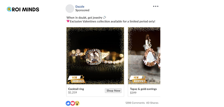
Because of this, an advertiser can only actively change and experiment with the creative at this time. An end user sees this. It’s also crucial to remember that social media advertising is no longer as affordable as it once was; in the past ten years, the cost has climbed by five to six times (because the number of social media users increased dramatically).
This implies that the worth of the users also rose. When social advertising first started, you didn’t have to worry as much about the specifics of what you showed to a user because the cost of poor performance wasn’t as high. However, the value of high-quality creatives has increased because of Facebook’s auction algorithm. This means that even if I submit a lower price, my creative will win and be presented to users if I submit an interesting creative that creates a positive user experience, and my competitors do not. This is how Facebook’s quality ranking functions.
The cost per conversion produced by high-quality and low-quality creative can vary by a factor of 10 at the same time. As a result, the only thing you can experiment with, test, and optimize is your creatives if you now want to drastically boost the performance of your commercials. It is also the choice that gives your company the best performance.
The rising popularity of skipping is another factor that makes creativity essential to your brand’s financial success. On social media, skippable ad forms have grown in popularity. For instance, practically all YouTube commercials were unskippable when they originally debuted. Today, consumers can swiftly bypass adverts before videos, swipe away your brand stories, and scroll through their feeds whenever they choose on Instagram. You must thus have eye-catching commercials because only they can stop people in their tracks and get them to watch your ads all the way through.
11 Most Useful Tips & Tricks Used to Create the Most Engaging Jewelry Facebook Creatives
As you navigate through your news page, a shoddy jewelry Facebook ad design suddenly pops up. You are unsure of what they are even selling because the visual is hazy, and the copy is unclear.
Starting out with Facebook ad design is difficult. There are numerous factors to consider. It’s hardly surprising that corporations and marketers alike struggle to come up with ideas for their upcoming advertisements.
The way we visually convey and expose our businesses to the public through ad design is crucial. Even if you have a fantastic product and an even better deal, it will be difficult to gain momentum if your advertisement is boring, difficult to understand, or both.
Great ad design:
- Attracts readers’ attention
- Informs them of who you are and what you have to offer
- Instructs them on how to take the crucial next step toward conversion
Even after overseeing over $600 million in Facebook ad spending globally, we continue to discover fresh, unexpected insights with each campaign we develop. Today, we want to share with you what we have learned from our ten years of diligent work: the 11 Facebook ad design tips that will help you create successful ad campaigns.
For both seasoned experts and brand-new beginners, each of these secrets is crucial. They’ll help you avoid wasting money on advertisements that users scroll over and don’t convert your intended audience.
If you’re prepared, let’s begin learning the techniques used in professional ad design.
Tricks Related to Using the Images in the Facebook Creative:
1. When designing, take your ad format into account
You must choose the ad format you will use before getting into the finer points of how an advertisement will look. Facebook presently offers eight primary ad forms in addition to several other versions, each of which is intended to achieve a distinct marketing objective.
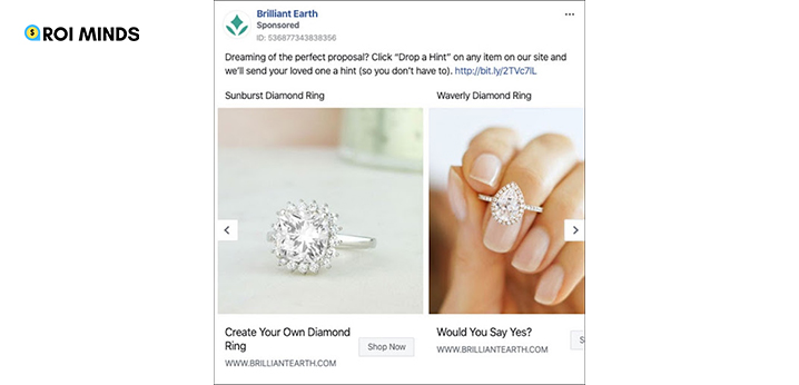
The following Facebook ad formats:
- Photo: This is the simplest style, where there is just one image and a brief copy header. Concentrate your efforts on using your single image to tell a compelling visual story.
- Video: Video formats are similar to image formats in that you can exhibit your company, item, or service throughout the course of an entire video.
- Stories: Stories are full-screen experiences that exist independently of the feed. Use all the space you can to make an impact and get their full attention.
- These advertisements are distributed to your clients via Messenger. Your best bet is to use short phrases and single-focus pictures.
- Carousel: A carousel allows you to display up to 10 distinct photos or videos, each with a link. This area can be used to showcase your latest offerings or imaginatively tell a tale.
- Slideshow: Slideshows sit in between photo and video advertisements. They make it simple to create commercials that combine audio with a slideshow of various images, but they use less data than video ads. They are, therefore, a better choice for places with bad internet connections.
- Collection: With this format, all of your products can be displayed in a digital showcase. Use straightforward visuals that highlight the product you are offering.
- Playables: These interactive adverts allow users to try out a game or application before downloading them, which can be very effective in some markets.
Consider how each of these ad styles can be used to increase the impact of your advertisements before you begin the design process. Carousel or collection advertising, for instance, can be a fantastic fit if you have a vast range of products to showcase. A video or story ad could provide you with the opportunity to demonstrate how your product functions if that is your goal.
What ad format would best serve your objectives should be taken into account while creating your advertisement. Remember that you can utilize a range of adverts; you don’t have to pick one.
2. Ad Positioning Should Influence the Design
The placement of your Facebook jewelry ads might be just as crucial as their design. The amount of space you have depends on the location of your ads, and creating without them in mind can be terrible.

Knowing your alternatives can help you select the optimal ad placement for your goals. Here is a list of typical ad locations, along with advice on how to use each one well:
- Desktop Newsfeed: Excellent for fostering interaction and generating leads and sales. Longer link descriptions and copies are supported in this format.
- Desktop Right Column: Cheaper but less efficient. Text is harder to read, and images are smaller. They are effective in retargeting users who are already familiar with your brand. To grab consumers’ attention, utilize a familiar image.
- Mobile Newsfeed: Excellent for interaction and exploration. Be concise, nevertheless, as this copy must be shorter.
- Marketplace: Make the most of your ad space to effectively present your product to users who are already looking to buy anything. There’s no need for overly creative flare.
- In-Stream Video: Similar to YouTube advertising, you may have your video ad play before or during highly visible video content. You practically get a bespoke audience because of this.
- Facebook Stories require creatives that are distinct, full-screen, and mobile-friendly. Story videos are limited to 15 seconds in length. The good news is that engaging with this type of material has a lot of benefits because more than 500 million users every day watch Facebook stories.
- Audience Network: These advertisements are shown in partner apps that are not Facebook apps. They cost far less than other placements, so even though they don’t convert quite as effectively, they can help you keep your acquisition and cost per click low.
You can read our comprehensive guide on Facebook ad placements as well as Facebook’s own resources on placement possibilities if you want to learn more about Facebook ad placement.
3. Clearly Communicate Your Value Proposition and Call To Action
Facebook claims that mobile users look at each post for an average of 1.7 seconds. By including your value proposition in your image and keeping your CTA succinct and clear, you can design your advertisement to catch their attention.
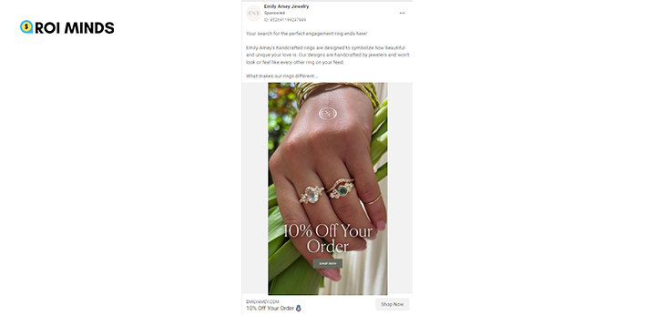
When creating your advertisements, keep in mind that consumers will only give them a little minute to be impressed. Make the most of that time by emphasizing your value proposition and keeping your call to action simple and straightforward.
4. Maintain Consistency Between Your Ad and Landing Page
Readers are given a promise in ads: click here to get this. High bounce rates can threaten your ROI if your Facebook ad and landing page designs don’t match visually.
Make sure to use recurring themes when creating your landing page and advertisement to make it simple for visitors to move from Facebook to your own website and other resources. Getting readers to click on your advertisement is challenging enough. You’re so close to success; don’t let your landing page fail you.
5. Correctly Size Your Images
Make sure your photos or videos are the right size and aspect ratio once you’ve begun constructing your advertisement. Images or videos with poor formatting may be distorted, blurry, or difficult to see.
You may include all the information you require and prevent unused space or unpleasant margins by using the right aspect ratio.
6. Use The Right Images
The photos you use in your Facebook ads serve as a representation of your company. Therefore, it’s critical that you utilize well-chosen (or specially created) images that pique readers’ interest and convey information about your company or product.
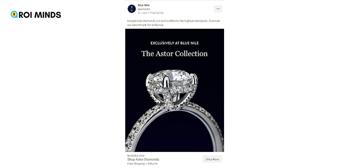
Facebook’s resource center is one of the greatest locations to discover what makes a great image for a Facebook advertisement.
Their advice comprises:
- Using a picture of a high caliber
- Displaying in the picture your brand’s goods or services.
- Limiting the amount of text.
- Giving the picture a distinct focus.
It doesn’t mix up the foreground and background elements or make it hard to identify the item that is for sale.
7. Anyone Can Produce Compelling Visuals
Graphic designers and photographers are not always talented, and hiring professionals can be expensive. So what can a tiny business do? Fortunately, there are reasonably priced solutions accessible.
Unsplash and Canva are two free tools that are well worth using.
It’s generally better to utilize images of your actual product or service, but there are situations when that isn’t feasible. People who sell T-shirts can snap images of their merchandise, but selling a cyber-security service is trickier. When original photography or design is not possible, search for a high-quality, royalty-free stock photo collection on Unsplash.
Simply enter a keyword to be presented with a list of pictures you may download and use.
You might wish to alter the picture once you’ve found the ideal one. You can use Canva, a free design tool, for that. Select one of their many templates after logging into your account and beginning to construct your advertisement.
With their drag-and-drop editing interface, upload your photo and start modifying it. To make your images stand out, you can use prefabricated components and text. You can utilize Canva’s limited free model or its more expensive premium plan, which offers more benefits and features.
8. Take Into Account Color Psychology
Your choice of colors while creating your Facebook advertisement might be just as crucial as your choice of photos or content. In fact, a study published in Management Decision found that color is to blame for up to 90% of all impulsive decisions made about things.
Utilizing contrast, color can be utilized to:
- Catch readers’ attention.
- Define your brand’s identity (for example, the blue of Facebook).
- Associate specific feelings or emotions with your items.
The last point is really important. According to science, distinct populations can respond psychologically differently to certain hues. For instance, it has been discovered that older people prefer colors with shorter wavelengths, such as blue and purple, whereas younger people prefer bolder hues, such as red and orange.
Consider the market you’re selling to, what they enjoy, and what they expect, and you’ll be thinking in the correct direction when choosing a hue. We’ve used the well-known illustration of several brands arranged according to hue to demonstrate how this operates in practice:
It’s possible that the gas produced for consumers by BP, Shell, Gulf, Exxon, and Mobil is the same. But because of their very distinctive brand colors, these businesses are greatly distinguishable in consumers’ minds. I might advise you to “go gray!” if you had to launch an oil company today. Make gas your apple!
The IT firms on the chart use a similar type of color psychology (outlined in blue). Apple is a symbol of peaceful, neutral aesthetic taste. Originally, Yahoo set out to arrange all of the information on the internet onto one home page, and they did a very excellent job of it. At least, they did at one point.
Maintaining simplicity is another recommended technique when using color. For the greatest results, aim to limit the number of colors in your advertisement to two or three. Any more than that risks becoming too much.
Colors are one of the most crucial elements in an ad designer’s toolbox, so use them with caution and consideration at all times. Your adverts would really benefit if you could achieve that while keeping things straightforward.
9. Use Location-Specific Imagery
The best thing about Facebook is that not every advertisement needs to be appealing to everyone. You can focus on a certain location or demographic. Use ad language and pictures that communicate to certain audiences to reflect this in your jewelry ads on Facebook design.
It’s important to show that you are aware of the local culture as well as to display a photo of a well-known local site. When aiming for San Francisco, anyone can use the Golden Gate Bridge as their backdrop.
Because it appealed to how residents of San Francisco saw themselves, the advertisement attracted a lot of attention online. The coding language stands out and is appealing to the local techies.
10. Design for Mobile
79% of Facebook users only used mobile devices to visit the site in 2020. For the best results, your Facebook ad design strategy must prioritize mobile devices. Making your movies and graphics vertical can help them display better on mobile devices and is one of the simplest ways to think mobile-first. In order to let the videos speak for themselves, they also keep the text to a minimum.
Designing for mobile also gives you access to some cool ad formats that aren’t available for usage on desktop, such as the 360-degree vertical ad. By tilting your phone, you may freely navigate the image while viewing the bakers’ faces and biographies. It’s a clever technique that only works on mobile and allows users to interact with your advertisement at their own pace.
Reusing your desktop advertisements doesn’t make sense, given how many people use mobile devices for social media. If you have to focus your efforts, think about making mobile-first and desktop-second your primary and second priorities. Ideally, you should be optimizing each ad for its unique format and placement.
11. To Choose the Best Facebook Ad Design, Use Split Testing
It will always be difficult to forecast how the general audience would respond to an advertisement, no matter how much you do and how much you learn. Advertisers may learn and improve moving forward by using split testing to determine which version of an advertisement performs best.
There are other ways to do a split test, but today we’ll focus on two in particular: the A/B test functionality in Facebook Ads Manager and the split test function.
A/B Testing on Facebook
- Enter your Facebook Ads Manager account first, then choose the campaign you wish to test. Press the “A/B Test” button after that.
- Next, decide which variable you wish to test. The audience, placement, and creatives are examples of potential variables.
- Next, decide if you want to compare two distinct campaigns or duplicate advertising initiatives.
- You’ll then need to enter some basic information, like the test’s name and schedule. Finally, decide how Facebook will select the A/B test winner. Once everything is ready, the test will be executed, and you will learn which ad performed better than the other.
Split Testing
- When you log in, select “New Campaign” from the dashboard.
- Afterward, enter the campaign name, pick a standard campaign, and select the promotion type you want to use.
- By entering several headlines, ad words, photos, and videos, you can then experiment with multiple versions of your advertisement. AdEspresso will automatically combine and contrast these various choices before reporting the outcomes to you.
Now It’s Up To You To Put Everything Together
You may draw attention and convey a tale with the aid of an excellent Facebook ad design. Each of these suggestions can assist you in achieving that, but it is up to you to combine them in the most effective manner for your good or service.
It’s crucial to keep in mind that an advertisement’s effectiveness is dependent on more than just appearance. For great advertisements to be effective, the copy must be compelling, and the overall advertising plan must be sound.
ROI Minds: Your Jewelry Facebook Ads Success Partner
Discover the power of captivating jewelry Facebook ads with ROI Minds. We’ve achieved an incredible 10X ROAS for an online jewelry store in just 1 month.
Why choose us?
Proven strategies for maximum ROI.
Expertise in jewelry marketing.
Results-driven approach.
10X ROAS guarantee.
Unlock your brand’s potential with ROI Minds. Contact us today for extraordinary Facebook ad results!

