Imagine a visitor exploring your business website, impressed by the services, but still determining the next steps. Unfortunately, they leave in frustration because there’s no clear direction on what to do next. In this scenario, a simple solution could have been a Call to Action (CTA) button, guiding visitors toward the next steps and turning their interest into a potential sale.
CTA buttons are vital in helping your audience navigate and take action, leading to increased sales for your business. These buttons act as friendly signposts, showing your visitors the way forward. Don’t let potential customers slip away – include effective CTA buttons on your website.
Check out some call to action examples to better understand how these simple yet powerful elements can make a significant difference in converting visitors into satisfied customers. Let’s make your website a user-friendly space that encourages action and boosts your business!
What Is A Call To Action?
A call-to-action, or CTA, is like a friendly nudge encouraging your website visitors, email readers, or ad viewers to take a specific action. It could be as simple as clicking a button, an image, or even following text instructions. These little cues guide users to the next step you want them to take. While CTAs are often clickable, they can be plain text without a link.
Having effective call-to-action buttons is crucial for your business’s growth. They play a big role in the success of your marketing efforts, influencing conversions, sales, and capturing leads. Think of them as virtual helpers, gently guiding your potential customers toward actions that benefit them and your business. Explore some CTA examples to see how these simple elements can make a big difference in engaging your audience and boosting your business.
Why Are CTAs Important?
In online engagement, the significance of Call to Action (CTA) marketing cannot be overstated. Join us as we delve into why CTA’s are crucial in guiding users, boosting conversions, and fostering meaningful interactions on websites and marketing materials.
-
Keeping Your Sales Funnel Moving:
Imagine CTAs as the helpful bridges guiding customers through their buying journey – from checking out videos to sharing an email or signing up for a free consultation. Without a CTA button, these actions become impossible. CTAs smoothly direct users to the next step, creating the easiest route for buyers. Users are accustomed to seeking and using CTAs; your job is to provide a seamless buying process.
-
Customers Crave Them:
Call to action examples aren’t just essential for businesses; customers want and expect them. Users depend on CTAs to lead them to the next step, making your brand engagement smoother. A visible CTA ensures clarity, building trust and speeding up the process. Predictability in CTAs enhances your brand’s reliability, especially in building trust. Strong calls to action in various mediums, including social media and digital advertising, are expected and contribute to a successful campaign.
-
Boosting Online Ads Success:
The call to action is the secret sauce that amplifies the impact of digital ad copies. With the right CTA, your copy messaging can maintain its punch. CTAs are vital in pay-per-click (PPC) advertising, where they clarify your campaign’s intent. In the fast-paced digital world, you can only afford to spend time capturing your audience’s attention. Prominently placed in your ad creative, a compelling CTA becomes the focal point, ensuring your campaign resonates with your audience and doesn’t fall on deaf ears.
What Are The Different Types Of CTAs?
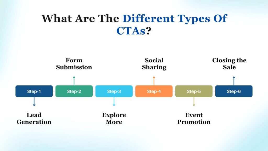
Effective Call-to-Actions (CTAs) involve understanding their diverse applications, with no one-size-fits-all solution. Explore the unique types tailored to specific needs.
1. Lead Generation:
Strategically place eye-catching call to action examples on high-traffic areas like landing pages, blogs, or floating banners. Ensure clarity about the benefit of clicking, guiding visitors seamlessly.
2. Form Submission:
Simplify the lead registration process by optimizing the “submit” button. Replace it with compelling text relevant to the marketing offer, enhancing the chances of visitors completing the form successfully.
3. Explore More:
Encourage engagement by enticing visitors to delve deeper into content with a “Read More” CTA. This enhances homepage aesthetics and ensures content receives the attention it deserves.
4. Social Sharing:
Facilitate interaction by strategically placing social media call to action buttons on relevant pages. Encourage sharing without overwhelming areas where personal information is exchanged.
5. Event Promotion:
Boost event awareness or ticket sales with event promotion call to action examples. Strategically position them based on the target audience, such as clients’ login pages, dashboards, or blog sidebars.
6. Closing the Sale:
Seal the deal with call to action examples focused on converting leads into customers. Strategically place these sales-focused CTAs at the end of blog posts or product pages, guiding potential customers toward informed decisions.
30+ CTA Examples To Capture Everyone’s Attention
Crafting compelling Call to Action (CTA) buttons doesn’t mean sticking to a rigid formula. Let your unique brand style shine through, resonating with site visitors. Here are some ways to add flair to your call-to-action marketing and make it stand out.
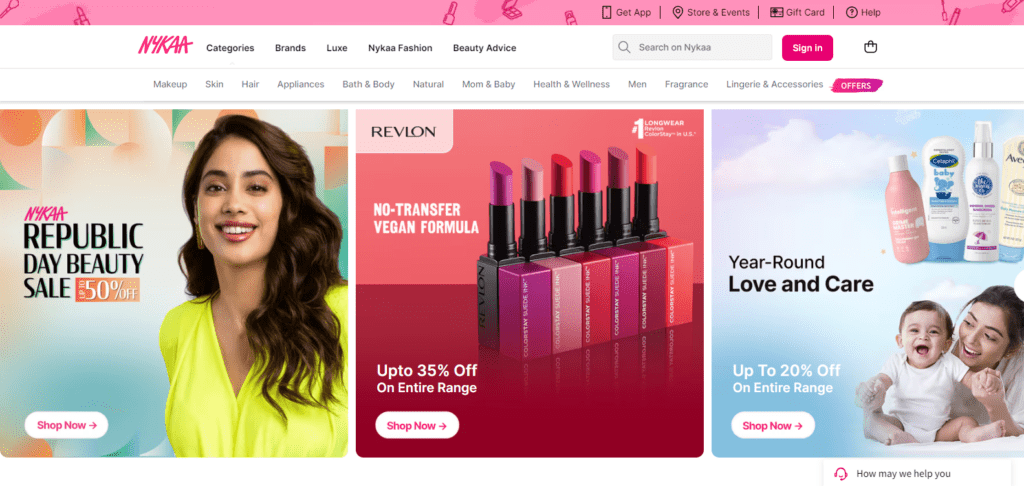
1. CTA: Buy Now
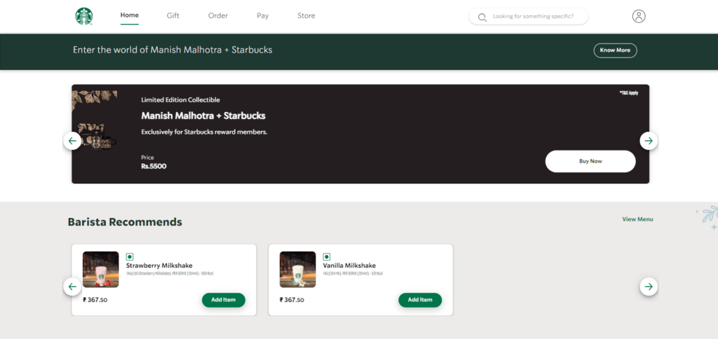
Certainly! You’ve likely come across call to action examples similar to this in eCommerce advertising. The primary aim is to sell, but instead of immediately redirecting the user to a webpage, the ad combines the influence of a celebrity name with a brand known for its delicacies.
In this instance, the “Buy Now” CTA is straightforward, while the ad copy takes the lead in persuading. Adding a limited edition tag and exclusivity for members generates excitement among the targeted audience, prompting them to seize the offer quickly.
2. CTA: Get 50 Leads for Free
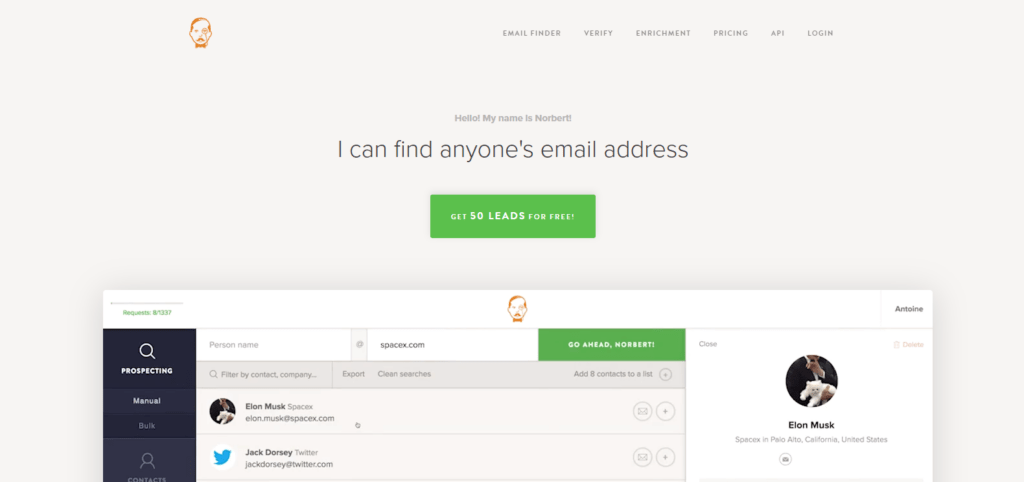
Consider a call to action marketing strategy as shown in the advertisement below. Instead of immediately urging users to a webpage, this call to action emphasizes the enticing offer of obtaining 50 leads at no cost.
The simplicity of the “Get 50 Leads for Free” directive is clear and compelling, aligning with a personalized approach to draw in potential leads. This call to action utilizes a straightforward message, creating a sense of value and benefit for users. It showcases the power of a direct and enticing offer, focusing on the immediate advantage for the audience.
3. CTA: Start free trial
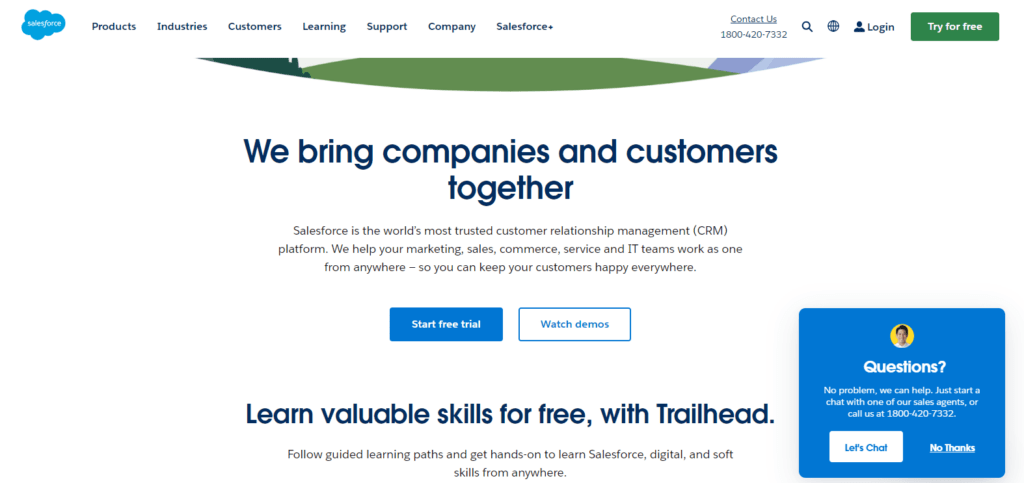
Explore this call to action magic: “Start Free Trial.” This isn’t just a button; it’s an invitation to experience something valuable at no cost. The simplicity of urging users to “Start Free Trial” conveys a straightforward message — an opportunity to try something without financial commitment.
The advertisement webpage has a minimalist colour scheme featuring two captivating, sparkly CTAs. Complemented by enticing colours, these buttons gracefully guide visitors to a page where they can embark on a trial journey. It’s more than a click; it’s an initiation into a trial experience, a digital adventure waiting to unfold.
4. CTA: Sign up
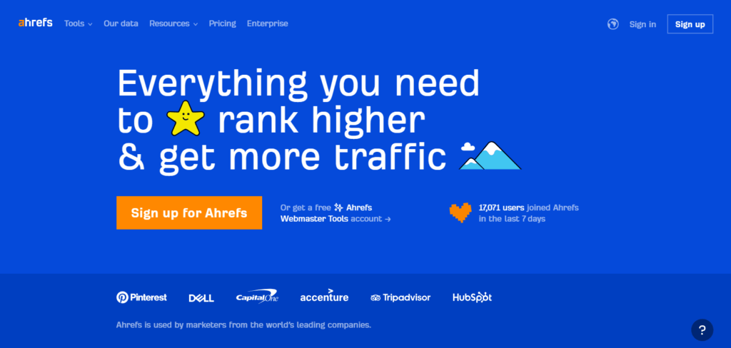
It’s not just a CTA; it’s an invitation to be part of something exciting. This call to action understands the power of simplicity, urging users to take that pivotal step – to sign up. In the below image from ahrefs, they have adorned their page with a sleek design where this CTA stands out, beckoning users to join the community.
In call to action examples, “Sign UP” shines as a beacon, promising an experience beyond a mere click. It’s not just registration; it’s an initiation into a world where users become valued members, unlocking exclusive content and opportunities.
5. CTA: Register Now

This call to action understands the art of simplicity, guiding users to take a pivotal step – to register now. This one stands out among the diverse array of call to action buttons, beckoning users to join a community that values their presence.
It’s not merely registration; it’s an initiation into an exclusive world where users unlock unique opportunities. This button’s subtle, soft, and warm colours add to the brand’s allure, attracting potential customers eager to explore the offerings.
6. CTA: Order now
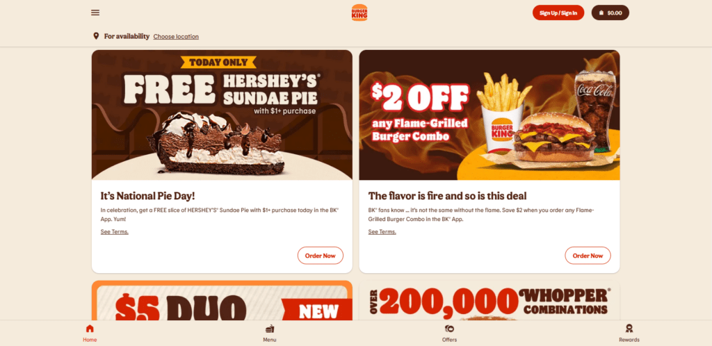
Dive into the delectable world of CTA example on a food website, where every click invites a culinary adventure. With a strategic blend of simplicity and urgency, it guides users to savour their favourite dishes with just one click. The marketing brilliance lies in the enticing offer – order now and indulge in the delights.
As a part of effective CTA marketing, the button prompts action and taps into the psychology of immediate satisfaction. Moreover, the added incentive of free food is a masterstroke, enticing customers to make choices and relish their favourite delicacies swiftly.
7. CTA: View All
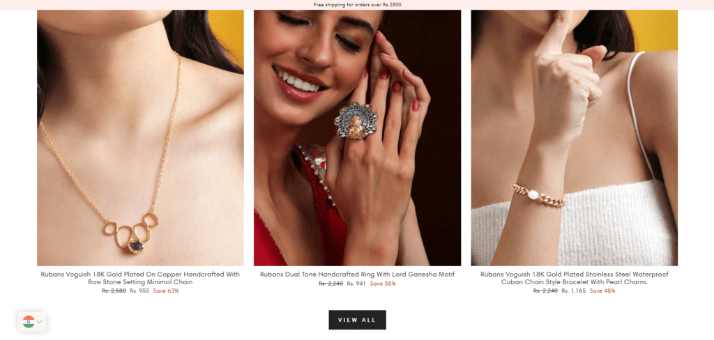
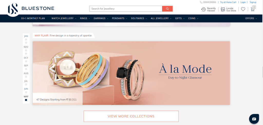
This call to action is a portal to a treasure trove of exquisite pieces. A strategic blend of simplicity and variety guides users to explore the entire jewellery collection with a single click. The marketing brilliance lies in presenting many options, each accompanied by a clear description and tempting discounts.
As a shining example of effective CTA, it encourages exploration and caters to diverse tastes, making it a gem in CTA examples. The carefully curated format and discounts offered add a touch of allure, attracting a potential audience with the promise of unique and discounted jewellery pieces.
8. CTA: Request a demo
Embark on a journey of possibilities with a compelling call to action like “Request a Demo.” This call to action understands the strength of simplicity, encouraging users to take that essential step – requesting a demo. Picture a webpage with a sleek design where all these call to action examples stand out, inviting users to explore the features firsthand.
In call to action marketing, “Request a Demo” shines brightly, offering more than just a click. It’s not merely a demo request; it’s an introduction to a realm where users gain insights, unlocking a firsthand experience of what the product or service offers.
9. CTA: Start Your Free Demo
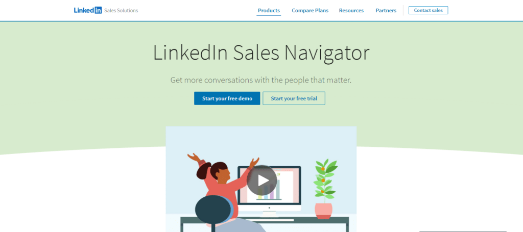
Explore the possibilities offered by the compelling “CTA: Start Your Free Demo” on your LinkedIn Sales Navigator page. This isn’t just a button; it’s a tailored invitation to discover what awaits you. This call to action understands the effectiveness of simplicity, encouraging users to take that important step – kickstarting a free demo.
Picture your Sales Navigator page with a sleek design where this CTA stands out, enticing users to delve into the product firsthand. “Start Your Free Demo” stands out among the call-to-action buttons, providing more than just a click. It’s not only about commencing a demo; it’s an introduction to a space where users gain hands-on insights, unlocking a firsthand experience of the potent tools available.
10. CTA: Try it
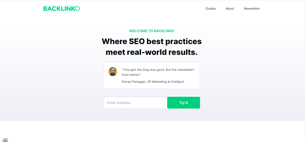
“Try It” is a straightforward yet impactful call to action among various CTA examples. The beauty of this button lies in its simplicity – the colours used are minimal, enhancing both its visual appeal and drawing the audience’s attention to the brand.
The straightforward nature of the “Try It” button makes it more than just a click; it’s an invitation to explore and engage. It’s not merely about trying a product or service; it’s an introduction to a world where users can discover the benefits firsthand. This simplicity in design and messaging makes “Try It” a standout among CTA examples, offering the audience a seamless and engaging experience.
11. CTA: Watch the Video
Embark on an immersive experience with the enticing “CTA: Watch the Video.” This is not your ordinary CTA button; it’s a personalized invitation to dive into visual storytelling. The beauty of this particular CTA button lies in its simplicity – the minimalistic design not only adds to its visual charm but also captivates the audience’s attention, directing it towards the brand.
Picture a webpage where call to action examples seamlessly integrates into a sleek design, prompting users to take a crucial step – watching the video. The straightforward nature of the “Watch the Video” CTA makes it more than just a click; it’s an invitation to explore a narrative visually. The simplicity in design and the clarity of the message make “Watch the Video” a standout CTA button, offering the audience a seamless and captivating experience.
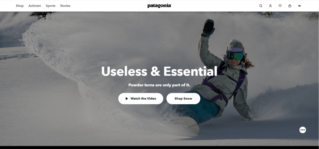
12. CTA: Shop Now
It is a personalized invitation that transcends the typical call-to-action, urging users to explore a world of products. “Shop Now” stands out with its minimalist design, visually appealing and draws attention to the brand. Picture a webpage where this CTA seamlessly integrates into a sleek design, prompting users to take a significant step – shopping now.
More than a mere click, it’s an invitation to discover various products effortlessly. Notably, including special events sales enhances audience reach and trust, making “Shop Now” a standout in call-to-action examples, offering a seamless and trustworthy shopping experience.
13. CTA: Add to cart
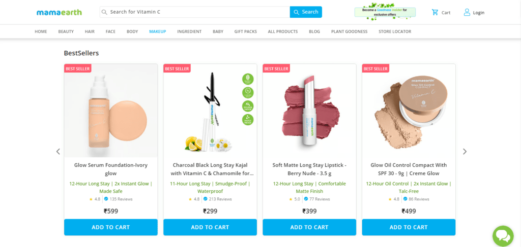
A call to action example like the “Add to Cart” shown in the given webpage image stands out in CTA marketing with its simple yet impactful design, seamlessly integrating into the brand’s aesthetic and capturing attention effectively.
This CTA blends effortlessly into a sleek design, encouraging users to take a vital step – adding items to their cart. The simplicity in design enhances visual appeal and ensures a user-friendly experience, making “Add to Cart” a standout in the world of CTA marketing, promising an intuitive and enjoyable online shopping experience at your fingertips.
14. CTA: Get Started for free
It’s a personalized invitation to initiate your experience without any financial commitment. “Get Started for Free” stands out with its simple yet impactful design, seamlessly merging with the brand’s identity while effortlessly capturing the user’s attention.
Envision a webpage where this CTA seamlessly integrates into a sleek design, urging users to take that essential step – starting for free. The design’s simplicity enhances visual appeal and ensures a user-friendly and risk-free experience. As an example of call-to-action examples, “Get Started for Free” excels, offering users a no-cost entry into a world of possibilities and services, ensuring a seamless and risk-free exploration.
15. CTA: Get Your 25% off Code
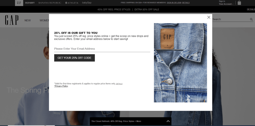
The call to action buttons take on a friendly demeanour, seamlessly integrating into the brand’s aesthetic while sparking excitement. This CTA harmoniously blends into a chic design, encouraging users to take a delightful step – claiming their 25% off code.
Beyond a mere click, it’s a brand’s gesture of goodwill, presenting a code as a gift to captivate attention and motivate customers to seize the opportunity and make their purchases. As an example of the call to action buttons, “Get Your 25% Off Code” offers savings and crafts a friendly and alluring experience, urging customers to embrace the code and indulge in the array of products available.
16. CTA: View more collections
One can imagine a fashion-forward webpage where this kind of call to action examples seamlessly integrates, urging users to take a stylish leap – delving into more collections. It transcends a standard click; it’s a distinctive call to action that grabs attention, setting it apart from typical CTAs.
This uniqueness is key in attracting a broader audience, compelling them to purchase and indulge in diverse products. In the realm of fashion call to action buttons, “View More Collections” stands out, creating an engaging and personalized experience that resonates widely, making the shopping journey more enjoyable and enticing.
17. CTA: Subscribe
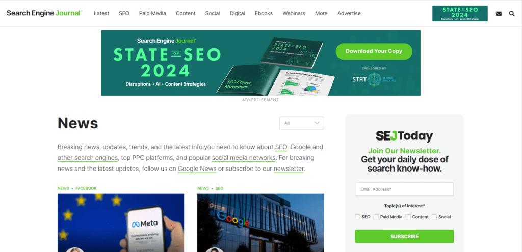
Stay in the loop with the captivating “CTA: Subscribe.” This isn’t just a button; it’s your exclusive pass to stay updated on the latest. The call to action buttons, strategically placed, create an inviting tone, seamlessly merging with the brand’s identity and sparking curiosity.
As an information provider, they go beyond a typical CTA, offering options for users to choose their areas of interest for tailored updates. This strategic move not only engages the audience effectively but also brings more traffic to their website, making the act of subscribing a personalized and enriching experience.
18. CTA: Join for free
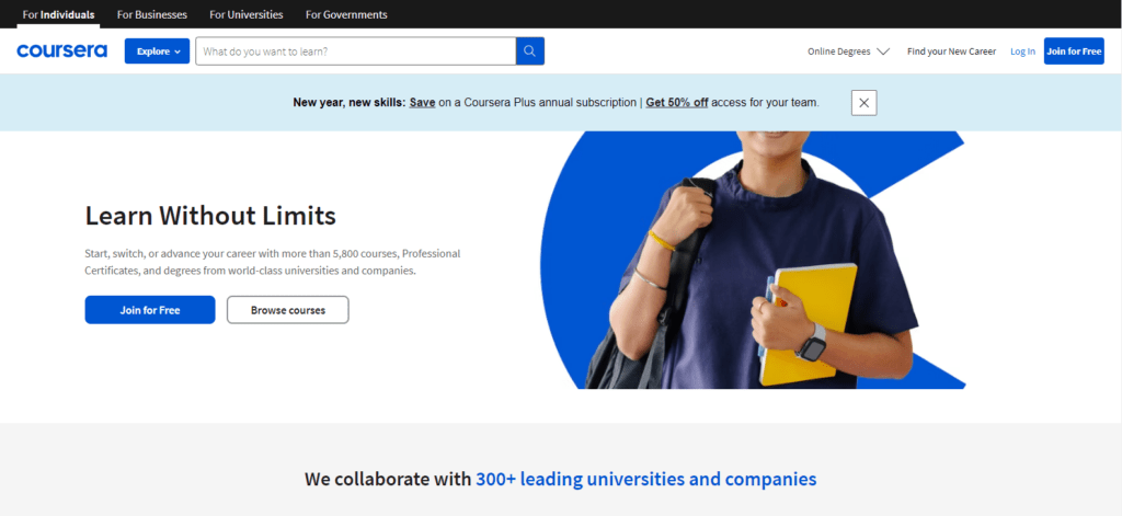
The call to action marketing approach is evident, seamlessly blending into the webpage’s design while maintaining a friendly and engaging tone. This CTA harmoniously integrates into a clean and inviting design, encouraging users to take a valuable step – joining for free.
The opportunity to experience a snippet of the course before committing to payment enhances user confidence, mirroring the effective CTA strategy employed by platforms like Coursera. This engages the audience effectively and builds credibility, making “Join for Free” a standout in online learning.
Related Post:
20+ Inspiring eCommerce Call to Action Examples to Unlock Maximum Conversions
20+ Social Media Call to Action Examples to Convert Followers into Customers
19. CTA: Redeem
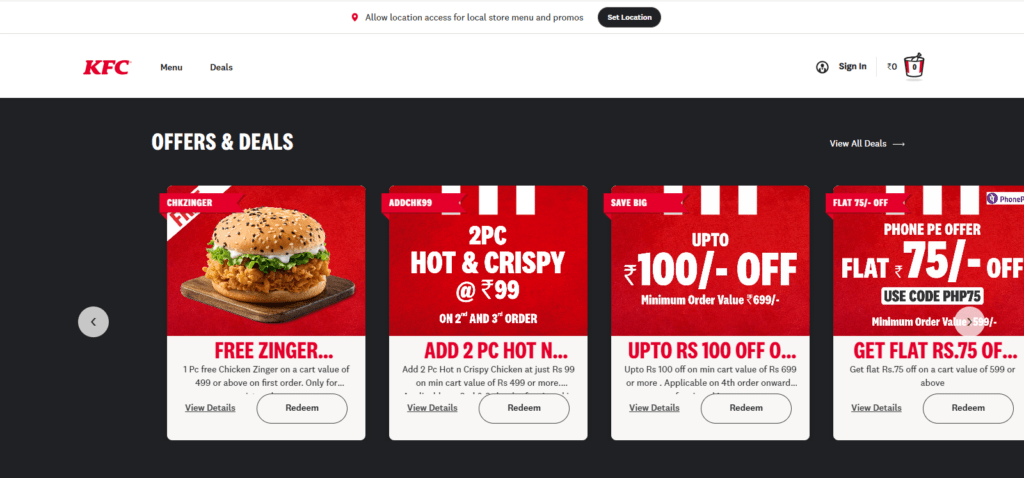
The call to action buttons on the enticing KFC webpage present a culinary journey awaiting exploration. The colour scheme, thoughtfully chosen to reflect the vibrancy of our savoury offerings, adds an extra layer of appeal.
The clever play on words makes the button more than just a call to action; it’s an enticing proposition for flavour enthusiasts. Visitors are encouraged to succumb to the temptation, click “CTA: Redeem,” and embark on a gastronomic adventure. With its fresh layout and delectable offerings, the KFC webpage promises a delightful experience for those who dare to click.
20. CTA: Learn more
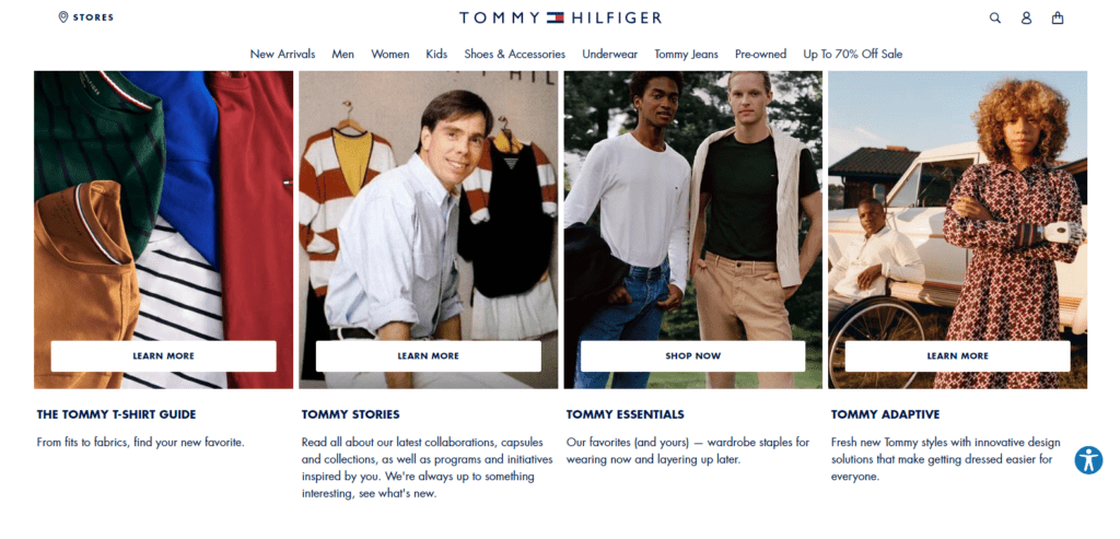
Embark on a style journey with Tommy Hilfiger’s website page, as provided below, where every detail reflects sophistication and timeless elegance. Amidst this sartorial elegance, you’ll encounter the magnetic “CTA: Learn More.” It’s not just a button; it’s an open door to unravel the rich tapestry of Tommy Hilfiger’s heritage and vision.
The colour scheme, akin to the brand’s iconic aesthetic, adds a touch of class to the button. In a clever play on words, we invite you to delve deeper into our story, discovering the threads weaving our legacy together. This call to action example doesn’t just beckon; it extends an invitation to immerse yourself in the essence of Tommy Hilfiger.
21. CTA: Download the App
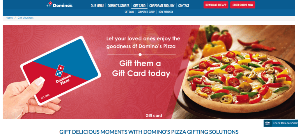
On Domino’s homepage, the irresistible aroma of freshly baked pizza permeates the digital space, and at the heart of it is the magnetic “CTA: Download the App.” Beyond a button, it’s an aromatic invitation to enhance your pizza-ordering experience. The colour scheme, thoughtfully chosen, aligns with Domino’s branding and triggers a sense of hunger, urging you to indulge in a delightful order. To satisfy cravings, click “CTA: Download the App,” and let the feast of flavours begin at your fingertips.
22. CTA: Get it First
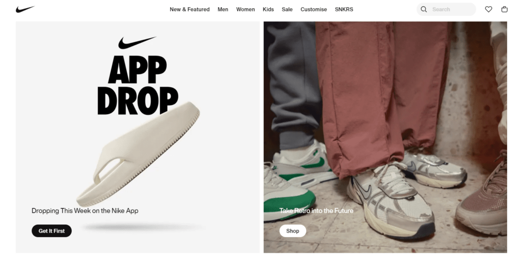
On the dynamic canvas of the Nike homepage, where the spirit of athleticism pulsates, behold the compelling “CTA: Get it first.” This isn’t just a button; it’s a sprint towards exclusivity, an invitation to be a trendsetter.
This CTA button isn’t a mere prompt; it’s a pledge to secure the newest releases before anyone else. In a clever play on words, we beckon you to lace up and lead the way in style. Click on “CTA: Get it first” not just to shop but to pioneer the next chapter of athletic fashion. Join the league of early adopters and embrace the thrill of being ahead in the game.
23. CTA: Book Tickets
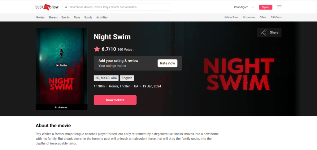
On the vibrant stage of BookMyShow’s homepage, where entertainment takes the spotlight, behold the captivating “CTA: Book tickets.” This isn’t just a button; it’s your backstage pass to a world of live experiences. The colour scheme, echoing the excitement of a live performance, sets the tone for a thrilling journey. In a clever play on words, we invite you to secure your seat in the front row of entertainment. Click on “CTA: Book tickets” and let the show begin. Your ticket to unforgettable moments awaits!
24. CTA: Play
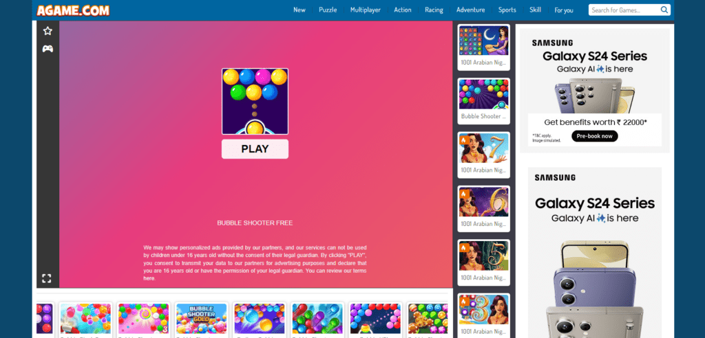
On the lively AGame homepage, where the spirit of gaming ignites, discover the exhilarating “CTA: Play.” This button is more than a prompt; it’s an entryway to an immersive gaming universe. The colour scheme, pulsating with energy, signals the excitement ahead. In a clever play on words, we invite you to dive into the action. Click on “CTA: Play” and let the call to action marketing unveil a world where every click sparks a thrilling gaming adventure. Level up your fun now!
25. CTA: Sign up now
On the dynamic webpage, where possibilities unfold, seize the moment with the compelling “CTA: Sign Up Now.” This isn’t just a button; it’s an open door to an exclusive realm. The carefully chosen colour scheme radiates an invitation to join a vibrant community. In a clever play on words, we urge you to leap. Click on “CTA: Sign Up Now” and let your journey begin. Your personalized experience awaits – sign up for a world of opportunities and instant access.
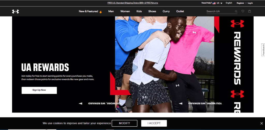
26. CTA: Explore More
Embark on a fitness odyssey with Under Armour’s webpage, where every step counts. Amidst the sporting allure, encounter the magnetic “CTA: Explore More.” This isn’t just a button; it’s an invitation to delve into the heart of athletic innovation. The colour scheme, mirroring the brand’s dynamic spirit, sparks curiosity.
In a clever play on words, we encourage you to navigate further. Click on “CTA: Explore More” and let your journey into performance excellence commence. Uncover a world of cutting-edge gear and athletic inspiration tailored just for you. Your exploration begins now!
27. CTA: Add to Bag
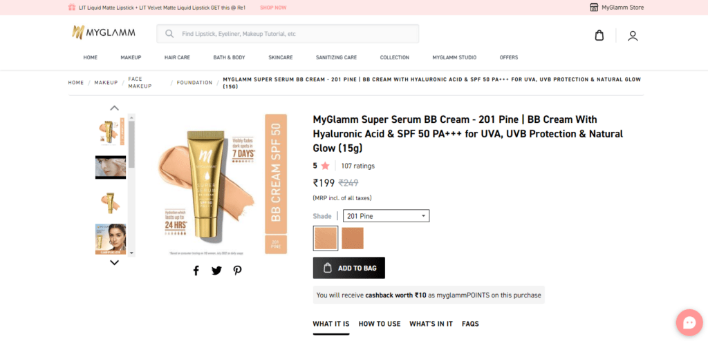
On the alluring MyGlamm beauty product webpage, where elegance meets innovation, behold the enchanting “CTA: Add to Bag.” This isn’t just a button; it’s an invitation to infuse your beauty routine with glamour. The colour scheme, reminiscent of chic sophistication, adds allure to your selections. In a clever play on words, we beckon you to indulge. Click on “CTA: Add to Bag” and let your beauty journey commence. Secure your favourites and glam up with the latest beauty essentials.
28. CTA: Rewards
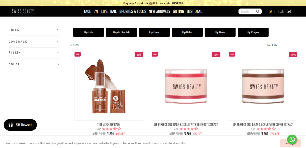
On the captivating Swiss Beauty product webpage, where beauty meets luxury, discover the alluring “CTA: Rewards.” This isn’t just a button; it’s an entryway to a world of beauty perks. The colour scheme reflects sophistication and sets the tone for a rewarding experience.
In a clever play on words, we invite you to unlock beauty benefits. Click on “CTA: Rewards” to adorn your beauty journey with exclusive treats. Your loyalty deserves to be celebrated – embrace the rewards and elevate your beauty regimen.
29. CTA: Book an Appointment
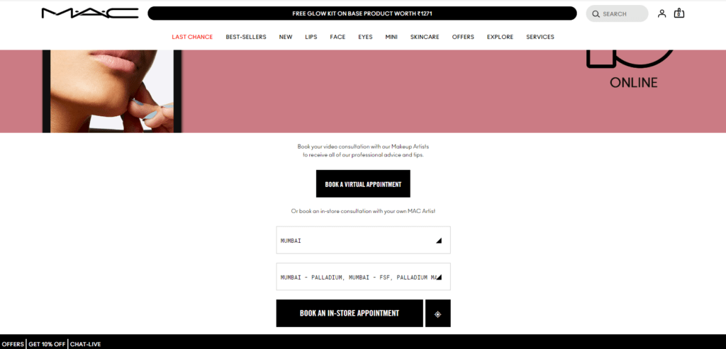
On the chic MAC webpage, where glamour takes centre stage, seize the moment with the compelling “CTA: Book an Appointment.” This isn’t just a button; it’s your VIP pass to personalized beauty sessions.
The colour scheme, echoing the brand’s aesthetic, signals a journey into customized glam. We urge you to schedule your beauty experience in a clever play on words. Click on “CTA: Book an Appointment” and let MAC’s beauty experts curate a look tailored just for you.
30. CTA: Download the Free Guide
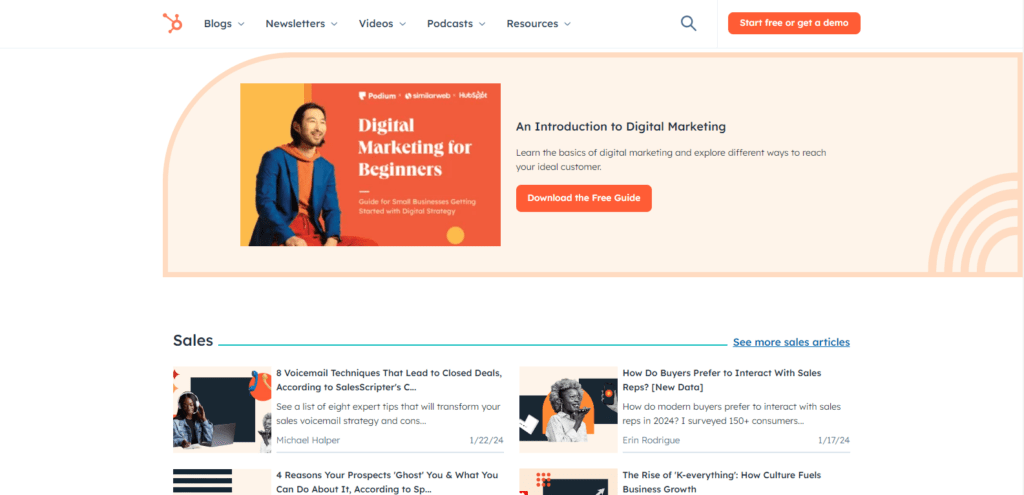
On the dynamic HubSpot webpage, where insights thrive, unlock knowledge with the enticing call to action example like “Download the Free Guide.” This isn’t just a button; it’s your gateway to valuable expertise. The colour scheme, reflecting clarity, hints at the wealth of information within.
In a clever play on words, we encourage you to enrich your know-how. Click on Download the Free Guide and let HubSpot’s wisdom guide your journey. Your access to strategic insights begins now – empower your endeavours with our free guide.
31. CTA: Start Learning
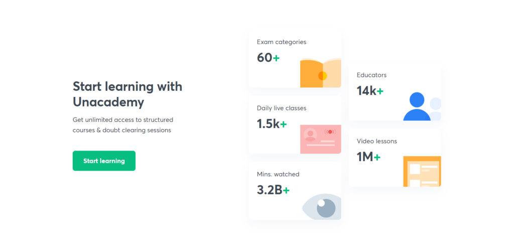
Embark on a knowledge odyssey at Unacademy’s course homepage, where education unfolds. Behold the empowering “CTA: Start Learning.” More than a button, it’s an invitation to fuel your curiosity.
They beckon you to commence your learning adventure. Click on “CTA: Start Learning” and let Unacademy’s courses be your guide. Your quest for knowledge begins now – take the first step towards a brighter future, exploring educational excellence with impactful call to action examples.
32. CTA: Discover More
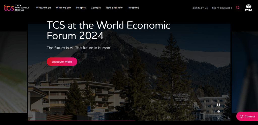
Embark on a digital journey at the TCS website homepage, where innovation takes center stage. Explore the captivating CTA marketing technique in the form of “ Discover More.” Beyond being a mere button, it extends an invitation to delve into technological brilliance. The carefully chosen colour scheme, echoing TCS’s dynamic spirit, sparks curiosity. Crafted with a touch of wit, we encourage you to navigate deeper. Your exploration of cutting-edge solutions begins now – dive into possibilities and embrace the future with TCS.
33. CTA: Get in Touch

Embark on a creative journey at Design Rush’s homepage, where innovation takes the lead. Encounter the compelling “CTA: Get in Touch.” Beyond a button, it’s an invitation to connect and explore possibilities. The color scheme, resonating with creative energy, signals a collaborative experience. In a playful play on words, we encourage you to reach out. Click on “CTA: Get in Touch” and initiate a conversation that transforms your vision into reality.
34. CTA: Place Order
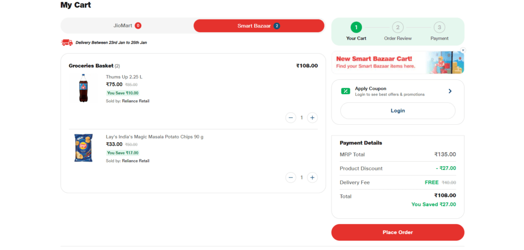
Embark on a hassle-free shopping experience as you reach JioMart’s checkout webpage, where simplicity reigns supreme. More than just a button, it’s your gateway to finalizing your selections. The color scheme, a testament to reliability, ensures a secure transaction. Witness the seamless transformation of your chosen items into a doorstep delight. Your journey to effortless shopping concludes here – confirm your order and let the joy of JioMart unfold, guided by intuitive call to action buttons.
35. CTA: Get Start Account
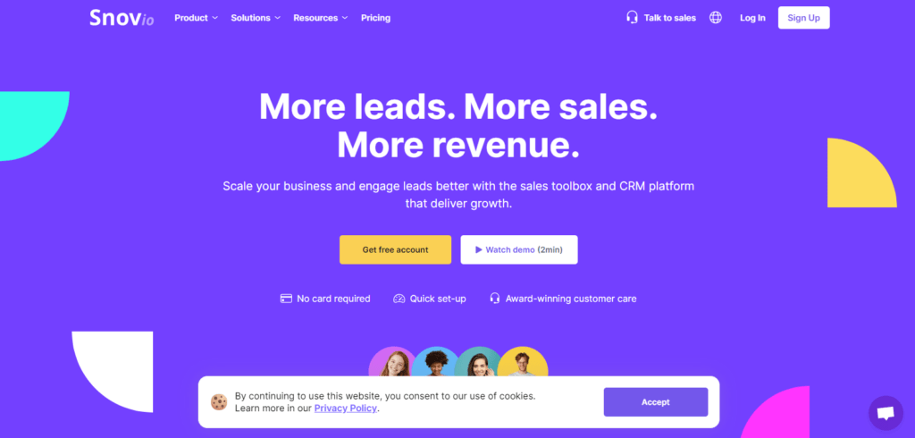
Embark on a journey into professional networking at Snovio’s homepage, where possibilities unfold. Beyond a mere button, it extends an invitation to create your networking hub. The color scheme, resonating with vibrancy, signals a dynamic platform. Crafted with simplicity, we encourage you to initiate your account setup.
Click on “Get Started Account” and witness the commencement of your networking expedition. Your connection to professional opportunities begins now – explore the ease of account creation with Snovio, guided by intuitive examples.
How To Craft An Engaging CTA?
Crafting engaging CTAs involves a few key strategies to connect with your audience:
- Consistency is Key: Use familiar brand colors and language to build trust, ensuring users feel comfortable clicking your CTAs.
- Stand Out: Grab attention by incorporating contrasting colors, arrows, and visuals that make your CTAs pop on the page.
- Command Attention: Utilize action-packed language to prompt users to click on your CTAs, encouraging immediate engagement.
- Highlight Value: Communicate the benefits users will receive when they click your CTA, emphasizing the value they’ll gain.
- Humanize Communication: Speak to visitors in a friendly, relatable manner. Use simple language and inject brand personality where appropriate.
- Transparency Matters: Be upfront about what users can expect after clicking your CTA, building trust and fostering transparency.
- Evoke Emotion: Infuse your CTAs with powerful language that resonates emotionally, motivating users to take action based on their feelings.
- Create FOMO: Trigger the fear of missing out by incorporating urgency into your CTAs, urging users to act swiftly.
- Device Compatibility: Ensure your CTAs work seamlessly on all devices, recognizing that many visitors browse on mobile or tablet devices. Responsive CTAs enhance user experience and engagement.
How To Use A Call To Action?
Every CTA serves a purpose, and understanding what works shapes your ad and landing page design. Our exploration into numerous CTAs revealed key insights:
Clear CTA:
Embrace the simplicity of a singular CTA to avoid overwhelming your audience. Imagine a landing page for an online course where the sole CTA encourages users to “Enroll Now.” This clear, focused message directs visitors towards a specific action, eliminating confusion and increasing enrollment chances.
Test Lead Temperature:
Consider a law firm running a Google & Facebook Ads campaign. The CTA might be “Learn About Your Legal Rights” for cold leads rather than the warmer “Book a Free Consultation.” Adjusting the CTA to match the audience’s level of interest aligns with the temperature of their intent, optimizing conversions based on contextual relevance.
Step By Step Technique:
Picture an insurance company guiding potential customers through an online quote process. By using breadcrumbs—progressive steps asking simple questions—the user agrees to the commitment of obtaining a personalized insurance quote. This technique minimizes resistance, enhancing the user experience and increasing conversion rates.
Contrast Colored Buttons:
Visualize a website with a blue-themed background. A contrasting color, like bright orange-yellow, ensures the CTA button stands out. This stark contrast makes the button visually appealing and encourages users to click, creating a visually distinct focal point amidst the background.
Avoid Using “Submit”:
Consider an e-commerce website urging visitors to sign up for exclusive deals. Instead of a generic “Submit” button, a personalized CTA like “Unlock My Deals” adds a touch of excitement. It aligns with the user’s desire for exclusive offers and increases the likelihood of clicking through, making the experience more engaging and rewarding.
How Do CTAs Guide Users Toward Desired Actions?
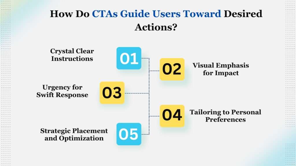
Using Call-to-Action (CTA) strategies is akin to conducting a symphony in the digital realm. These crucial elements serve as navigational beacons, guiding users through a choreography of clarity, visual emphasis, urgency, personalization, and strategic optimization, compelling desired actions.
1. Crystal Clear Instructions:
Effective CTA marketing hinges on providing users with straightforward and unambiguous instructions. Whether it’s prompting them to “Start Shopping” or “Claim Your Free Trial,” the clarity ensures users understand the intended action. Call to action examples like these cut through confusion, guiding users seamlessly to their next steps.
2. Visual Emphasis for Impact:
Call to action buttons are more than mere elements on a page; they serve as visual cues, drawing attention and guiding users. Through strategic placement, contrasting colors, and compelling design, these buttons act as signposts, emphasizing where users should focus their attention and encouraging interaction.
3. Urgency for Swift Response:
The art of CTA marketing lies in crafting messages that evoke urgency. Phrases such as “Limited Time Offer” or “Act Now” instill a sense of immediacy, compelling users to respond promptly. This urgency guides users towards making quick and decisive actions, ensuring they take advantage of valuable opportunities.
4. Tailoring to Personal Preferences:
Successful CTA marketing involves personalization aligning CTAs with user preferences. By tailoring messages to resonate with individual interests, such as “Explore Personalized Deals” or “Plan Your Perfect Getaway,” businesses guide users toward actions that align with their unique needs and desires.
5. Strategic Placement and Optimization:
CTA marketing strategically places a call to action at crucial touchpoints. Whether at the end of blog posts, in email signatures, or on landing pages, these placements guide users seamlessly. Additionally, the continuous process of A/B testing ensures optimization, allowing businesses and digital marketing agencies to fine-tune CTAs for maximum effectiveness, aligning with user behaviors and preferences.
Conclusion
In the vast landscape of digital marketing, crafting effective Call-to-Action (CTA) buttons is akin to placing signposts on the online highway. As we wrap up this exploration of 30+ tested CTA examples that capture attention, remember that the success of your CTA lies in its ability to stand out amidst the digital noise.
These examples are more than mere buttons; they are the navigational beacons guiding users towards meaningful interactions. From compelling phrases to vibrant designs, each example tells a unique story, resonating with diverse audiences. Implementing these call to action examples isn’t just about pushing buttons; it’s about creating a tailored journey for your audience, an invitation to engage, click, and connect.
So, embrace the power of CTA marketing, let your buttons speak volumes, and watch as your audience eagerly responds to the call, taking your digital endeavors to new heights.
")


")