Imagine scrolling through an online store, captivated by a product that seems perfect for you. You’re interested, but something keeps you from clicking “add to cart.” It is where the magic of an effective call to action on eCommerce site comes in.
Think of a CTA as your online salesperson’s final pitch, a persuasive prompt that bridges the gap between browsing and buying. Done right, eCommerce call to action examples can be powerful tools, transforming curious visitors into loyal customers.
This guide delves into CTAs, exploring over 20 inspiring examples and strategies to help you craft the perfect call to action for your online store. We’ll explore different types of CTAs, how to tailor them to your target audience, and the secrets behind crafting CTAs that unlock maximum conversions and transform your website into a sales powerhouse.
Importance of Call to Action (CTA) for eCommerce Websites
Your online store is a treasure trove of amazing products with captivating descriptions and eye-catching visuals. Visitors arrive, browse around, and seem genuinely interested. Yet, your sales could be higher than expected. What’s the missing puzzle piece? It’s the eCommerce call to action.
1. Your Digital Signposts
Think of eCommerce CTA examples as helpful signposts throughout your online store. They guide hesitant shoppers, nudging them from “just browsing” to “add to cart” and, ultimately, to “order placed!” Without these clear directions, your customers might get lost, unsure of how to take the next step, and eventually abandon their carts.
2. The Power of Persuasion
An effective CTA isn’t just about telling someone what to do; it’s about giving them a compelling reason to do it. Simple phrases like “Shop Now,” “Discover More,” or “Claim Your Discount” tap into the psychology of decision-making. They generate a sense of urgency, exclusivity, or curiosity, transforming passive visitors into active buyers.
3. The Success Roadmap
A well-placed CTA doesn’t just boost individual sales – it creates an effective call to action on eCommerce site. By strategically incorporating CTAs throughout your website – from blog posts to product pages to email newsletters – you guide users along their journey, increasing the likelihood of them hitting that final, all-important “Checkout” button.
4. CTAs are the key to unlocking your store’s potential
- Increased conversions: Turn window shoppers into paying customers.
- Smoother customer journey: Reduce abandonments and create a frictionless shopping experience.
- Enhanced engagement: Encourage click-throughs, shares, and sign-ups to build a loyal customer base.
Key Components of Effective eCommerce CTAs
You’re seriously considering adding it to your cart, but something holds you back. You may miss that final push, a clear and compelling reason to leap.
Enter the effective call to action on eCommerce site, your online salesperson’s final persuasive pitch. This crucial element bridges the gap between browsing and buying, transforming curious visitors into loyal customers. Just like a strong closing statement, well-crafted eCommerce call to action examples can be the deciding factor in converting interest into action.
But crafting truly effective eCommerce CTA examples is an art form requiring strategic combinations of key components. Let’s dive into the five essential elements that will transform your CTAs from bland to brilliant, turning website visitors into enthusiastic customers:
A. Clarity and Simplicity
- Rule of thumb: Use concise and action-oriented language like “Shop Now,” “Add to Cart,” or “Learn More.”
- Avoid jargon: Ditch confusing phrases that leave your audience scratching their heads.
- Remember: Your CTA should be the clear and final step towards a desired action.
B. Urgency and FOMO (Fear of Missing Out)
- Power of urgency: Use phrases like “Limited Time Offer,” “Last Chance to Save,” or “Only 5 Left in Stock” to create a sense of urgency and encourage immediate action.
- FOMO (Fear of Missing Out): Tap into the human desire to avoid missing out on a good deal.
- Use strategically: Employ these tactics sparingly to avoid sounding overly promotional or manipulative.
C. Personalization and Relevance
- One-size-fits-all is a recipe for failure: Tailor your CTAs to your audience and their specific needs.
- Example: “Repurchase Your Favorite” for returning customers, “Explore Our Top Sellers” for new visitors.
- Connect deeper: Using relevant and personalized language increases the likelihood of them clicking through.
D. Placement and Visibility
- Strategic placement: Position your CTAs prominently throughout your website, like at the end of product descriptions, blog posts, and landing pages.
- Easy to find: Ensure they are visually prominent and easy to locate, using contrasting colors or clear buttons.
- Think accessibility: Make your CTAs accessible to all users, including those with visual impairments.
E. Design and Visual Appeal
- Visual creatures: Humans like visually appealing elements, and CTAs are no exception.
- Experiment and refine: Try different colors, fonts, and button styles to find what resonates with your audience.
- Seamless blend: Ensure your CTA design complements your overall website aesthetic.
By mastering these five key components, you can craft eCommerce call to action examples that are clear, persuasive, and visually appealing. These CTAs will act as your silent salespeople, guiding visitors toward desired actions and ultimately driving conversions that take your online business to the next level.
Let’s Explore 20+ Inspiring eCommerce Call to Action Examples
In the dynamic world of eCommerce PPC, a captivating product image or enticing description might lure visitors in. Still, the power of a well-crafted call to action seals the deal. Think of your CTA as the final persuasive push, a guiding beacon that propels hesitant browsers toward becoming enthusiastic customers.
With endless possibilities, crafting the perfect CTA can feel overwhelming. So, let’s dive into a collection of over 20 inspiring eCommerce call to action examples designed to unlock your website’s potential and drive those much-desired conversions.
1. eBay
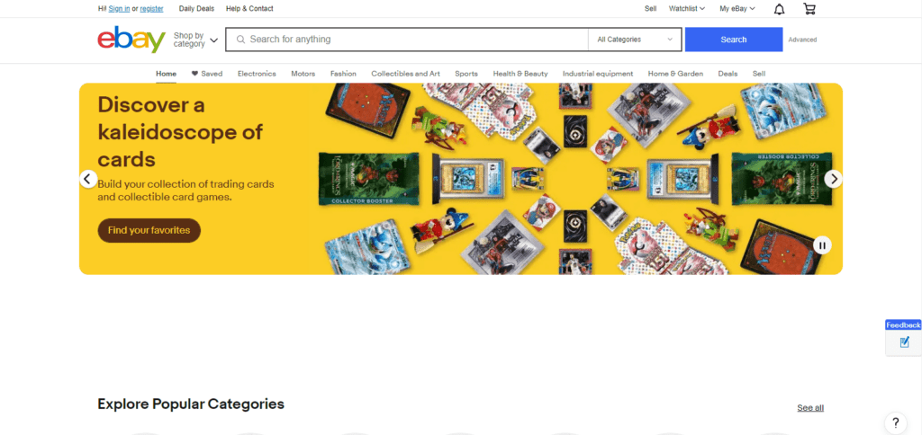
CTA: Find Your Favorites
The eCommerce call to action examples on eBay, while seemingly simple, use the power of personalization. It speaks directly to the individual, encouraging them to discover their unique “favorites” amidst the vast selection. Using a neutral blue complements the brand’s established identity and avoids overwhelming the user.
2. Amazon
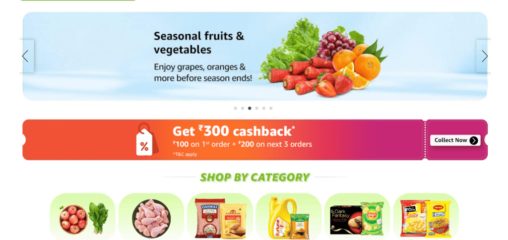
CTA: Collect Now
Amazon’s CTA entices users to take advantage of limited-time offers and build collections, fostering a sense of urgency and exclusivity. The prominent faded orange button stands out, grabbing attention and prompting action.
3. Etsy

CTA: Show More
The eCommerce call to action examples from Etsy utilize the principle of curiosity. It invites users to discover a wider range of products, potentially leading them down a browsing path filled with unexpected delights. The muted gray button blends seamlessly with the overall aesthetic, maintaining a user-friendly experience.
4. Walmart

CTA: Shop All
Walmart’s CTA is direct and all-encompassing. It encourages users to explore the entire product range, catering to individuals seeking an effective call to action on eCommerce site. The bold white with black border button aligns with the brand’s established visual identity and reinforces a sense of trust and reliability.
5. Best Buy
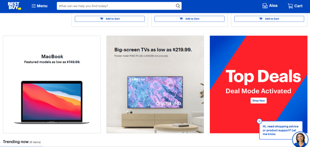
CTA: Shop Now
Best Buy’s CTA is clear and concise, urging users to make an immediate purchase. This straightforward approach is ideal for products users are likely ready to buy after browsing and comparing. The vibrant blue text of the button aligns with the brand’s energetic image and encourages decisive action.
6. Target
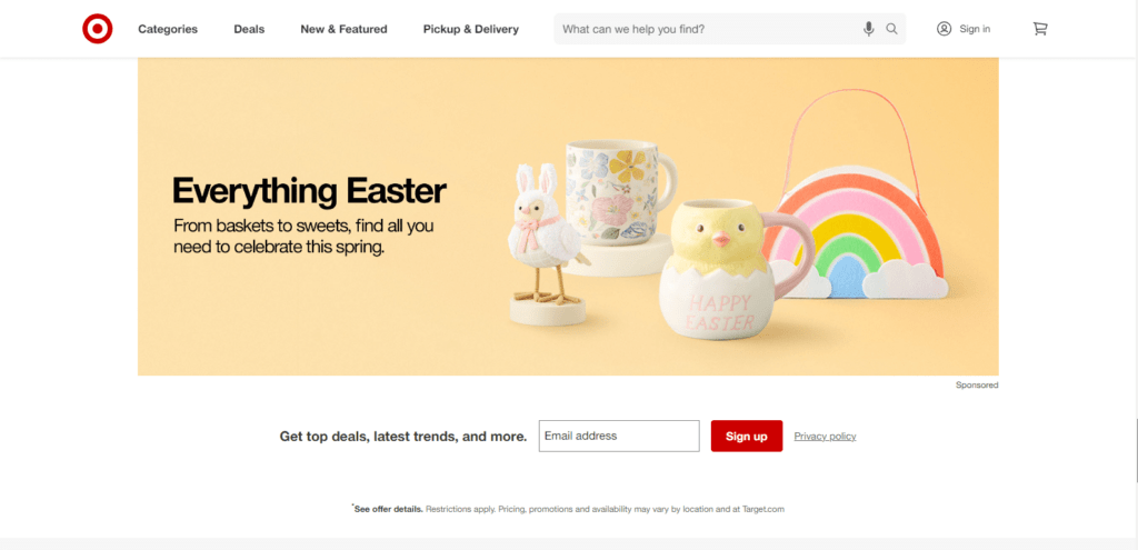
CTA: Sign Up
The eCommerce CTA examples from Target focus on building long-term customer relationships. By encouraging users to sign up for their latest trends and updates, they incentivize repeat purchases and glean valuable customer data. The red button stands out, drawing attention to the offer.
7. Home Depot
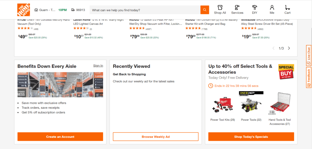
CTA: Shop Today’s Specials
Home Depot’s CTA highlights limited-time deals, creating a sense of urgency and encouraging impulse purchases. The orange button complements the brand’s color scheme and adds a touch of vibrancy to the website.
8. Costco
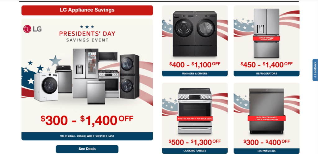
CTA: See Deals
Costco eCommerce CTA examples pique user curiosity by simply inviting them to explore current deals. This approach taps into the innate human desire to discover bargains, potentially leading users to unexpected finds. The navy blue button creates a visual contrast and encourages exploration.
9. Wayfair
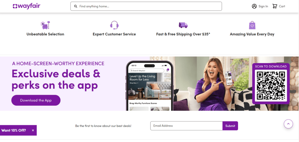
CTA: Download the App
This eCommerce CTA example from Wayfair focuses on expanding the shopping experience beyond its website. By encouraging users to download the app, they increase accessibility and an effective call to action on eCommerce site. The bold purple button aligns with the brand’s color scheme and creates a sense of trust.
10. IKEA
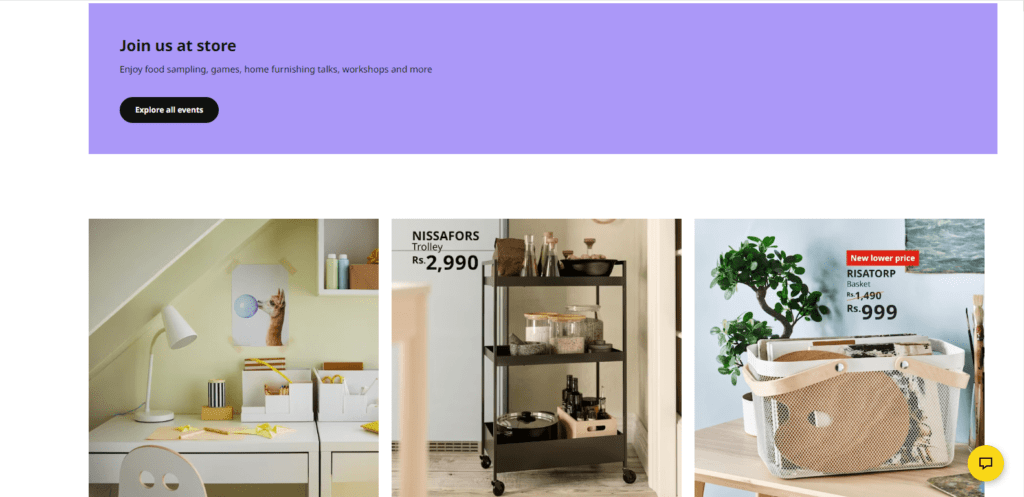
CTA: Explore All Events
IKEA eCommerce call to action examples go beyond the traditional “Shop Now” approach. It invites users to discover in-store events and workshops, fostering a sense of community and engagement. The color black button reflects the brand’s theme for individuals in love with the theme.
Related Post:
30+ Tested Call To Action Examples That Capture Attention
20+ Social Media Call to Action Examples to Convert Followers into Customers
11. Alibaba

CTA: Chat Now
Alibaba’s CTA caters to businesses seeking quick and personalized communication. This option allows for real-time interaction and fosters trust, potentially leading to an effective call to action on eCommerce site. The white button with a black border blends seamlessly with the platform’s overall design, maintaining a professional aesthetic.
12. Chewy
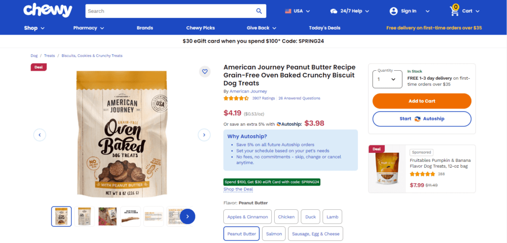
CTA: Add to Cart
The straightforward eCommerce CTA examples from Chewy focus on immediate action. It’s ideal for users who have already found the product they need and are ready to purchase. The orange button complements Chewy’s branding and creates a sense of urgency.
13. Kroger
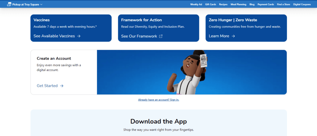
CTA: Get Started
Kroger eCommerce call to action examples encourage users to take the first step towards online shopping. This could involve creating an account or signing up for delivery services. The blue color text of the CTA aligns with the brand’s established identity and promotes a sense of freshness and convenience.
14. Nike
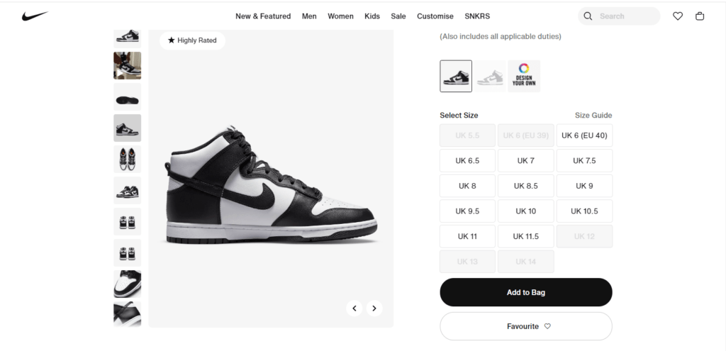
CTA: Add to Bag
Nike’s CTA leverages its brand terminology to create a sense of exclusivity and belonging. It encourages users to add desired items to their “bag,” mirroring the experience of a physical store and fostering an effective call to action on eCommerce site. The black button reflects the brand’s black beauty image and encourages action.
15. Adidas

CTA: Explore More
The eCommerce CTA examples from Adidas invite users to delve deeper into their product range. This strategy caters to individuals who might be browsing or undecided, encouraging them to discover a wider variety of options. The white button maintains a clean and sophisticated aesthetic, aligning with the brand’s image.
16. Mamaearth
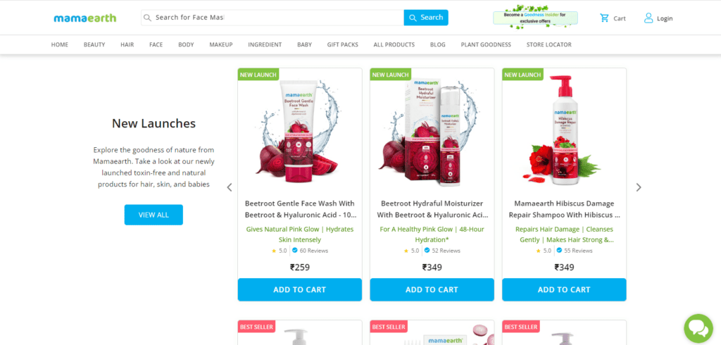
CTA: View All
The eCommerce CTA examples from Mamaearth are concise and straightforward, inviting users to explore their entire product range. The simplicity of the CTA complements the brand’s clean and minimalist approach to design. The light blue button blends seamlessly with the overall aesthetics, maintaining a user-friendly experience.
17. Steve Madden
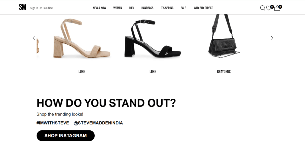
CTA: Shop Instagram
Steve Madden eCommerce call to action examples leverage the power of social media. It encourages users to seamlessly transition from browsing Instagram posts to exploring their eCommerce website, potentially leading to immediate purchases. The black button with white text echoes the brand’s personality and creates a sense of excitement.
18. Juneshine

CTA: View Flavors
Juneshine’s CTA piques users’ curiosity by inviting them to discover different product variations. This approach caters to an effective call to action on eCommerce site for individuals who might be unfamiliar with the brand or are looking for specific selections. The bold black button blends harmoniously with the overall design, maintaining a clean and inviting aesthetic.
19. Printful
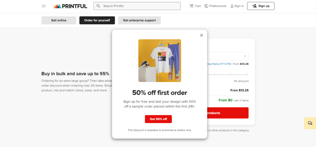
CTA: Get 50% Off
The eCommerce CTA examples from Printful employ a powerful discount offer to entice users. This strategy capitalizes on the desire for value and can lead to immediate conversions, especially for first-time customers. The bright orange button stands out prominently, drawing attention to the offer.
20. Cartier

CTA: Select Size
Cartier’s eCommerce call to action examples are specific and action-oriented. It guides users toward the next step in the purchase process, assuming they already have a specific product in mind. The subtle black button aligns with the brand’s luxurious image and maintains a sophisticated aesthetic.
21. Gucci

CTA: Explore the Looks
Gucci’s CTA goes beyond the traditional product focus, inviting users to immerse themselves in the high fashion world. The approach of using eCommerce CTA examples caters to individuals seeking inspiration and a sense of belonging to the brand’s luxurious lifestyle. The white button maintains a sophisticated aesthetic while the compelling text invites users to explore.
Best Practices for Implementing Effective eCommerce CTAs to Drive More Conversions
You’re on the verge of adding it to your cart, but something holds you back. You may be missing that final push, that clear and effective call to action on eCommerce site. Like a skilled salesperson, a well-crafted CTA can bridge the gap between browsing and buying, transforming casual visitors into loyal customers.
However, creating effective eCommerce CTA examples is more than just slapping a generic “Buy Now” button on your website. It’s about crafting a strategic and personalized call to action that resonates with your audience and drives them toward conversions.
A. Conduct A/B Testing
- Embrace the experiment: A/B testing allows you to compare different versions of your CTAs with the help of eCommerce Google Ads. It helps in analyzing which ones perform better with your target audience.
- Test different elements: Experiment with various factors, such as CTA copywriting, button design, color scheme, and placement, to discover the most effective combinations.
- Data-driven decisions: Use the insights from A/B testing to optimize your CTAs, ensuring they maximize conversion rates continuously.
How To Implement:
Choose specific aspects of your CTA, like the copy (e.g., “Shop Now” vs. “Treat Yourself Today”), button color, or position.
Divide your website traffic into two groups, showing each group a different version of the CTA.
Use website analytics tools to track each version’s click-through and conversion rates. Choose the option that performs better and iterate further.
B. Monitor and Analyze User Behavior
- Dive deeper: Utilize website analytics tools to understand how users interact with your CTAs. Track metrics like click-through rates, conversion rates, and user behavior patterns.
- Identify engagement cues: Analyze where users engage most with your website and strategically place eCommerce call to action examples in those areas.
- Listen to your audience: Pay attention to user feedback through surveys, reviews, and support channels to understand their preferences and tailor your CTAs accordingly.
How To Implement:
These visual tools show where users click on your website, helping you identify areas of high engagement and ideal CTA placement.
Analyze how users navigate your website, identifying potential drop-off points where strategic CTAs can encourage further action.
Encourage user feedback through surveys and polls to understand their preferences and tailor eCommerce CTA examples accordingly.
C. Continuously Optimize CTAs
- Stay agile: The landscape of online commerce is constantly evolving, so your CTAs must also adapt.
- Refine and iterate: Based on A/B testing results and user behavior insights, continuously refine the copy, design, and placement of your CTAs.
- Embrace change: Don’t be afraid to experiment with new approaches and test unconventional CTAs to see what resonates with your audience.
How To Implement:
Set a timeline for revisiting and refining your CTAs based on A/B testing results and user behavior insights.
Adapt CTAs to reflect seasonal trends and promotions, keeping them fresh and relevant.
Utilize A/B testing tools to streamline the process of testing and implementing changes to your CTAs.
D. Keep CTAs Consistent Across Devices
- Mobile-first mentality: With the rise of mobile shopping, ensuring your eCommerce call to action examples across all devices is crucial.
- Responsive design: Make sure your website and CTAs adapt seamlessly to different screen sizes and devices, ensuring a smooth user experience for everyone.
- Accessibility considerations: Design your CTAs with accessibility in mind, making them easily visible and usable for all users, regardless of their abilities.
How To Implement:
Ensure your website and CTAs automatically adjust to different screen sizes for a seamless user experience across devices.
Test your CTAs on different devices (desktop, mobile, tablet) to ensure they are clear, clickable, and visually appealing.
Since mobile shopping is on the rise, prioritize the clarity and effectiveness of your CTAs on mobile devices.
E. Incorporate CTAs Throughout the Customer Journey
- Beyond the product page: Don’t limit your CTAs to product pages alone. Include them strategically throughout the customer journey, from blog posts and landing pages to email marketing campaigns and social media channels.
- Context is key: Tailor your CTAs to the specific stage of the customer journey. Use CTAs like “Learn More” or “Download Your Guide” for educational content, while “Add to Cart” or “Buy Now” might be more suitable for product pages.
- Create a clear path: By strategically placing an effective call to action on eCommerce site across different touchpoints, you guide users towards the desired outcome, ultimately leading to a higher conversion rate.
How To Implement:
Identify the different touchpoints users have with your brand (e.g., blog, social media, product pages) and determine the best fit for CTAs at each stage.
The CTA should seamlessly flow from the content it follows. For informational content, use CTAs like “Learn More” or “Download Your Guide,” while product pages can utilize “Add to Cart” or “Buy Now.”
Use analytics tools to monitor the effectiveness of CTAs across different channels, allowing you to identify areas for improvement and optimize your overall marketing strategy.
Unlock the Potential of Your Online Store: Partner with ROI Minds for Supercharged Conversions

💻 Imagine your online store overflowing with interested visitors captivated by your products. Yet, for some reason, sales aren’t soaring as expected. The missing piece? Compelling eCommerce call to action examples to guide shoppers towards that final click.🛍️
💻 That’s where ROI Minds, the best eCommerce marketing agency, steps in as your expert guide in eCommerce conversions. We understand that a well-placed, strategically designed call to action is the ultimate bridge between “browsing” and “buying.”🛍️
🔊 Partnering with us means:
- Expert CTA analysis: We’ll dissect your existing eCommerce CTA examples, pinpointing strengths and areas for improvement.
- Data-driven optimization: Backed by analytics and insights, we’ll refine your CTAs for maximum impact on conversion rates.
- Tailored strategy: We’ll design an effective call to action on eCommerce site, personalized to your target audience and unique brand voice.
💻 Stop leaving potential sales on the table. Experience the ROI Minds difference as we revamp your call to action game. Get ready to watch hesitant shoppers transform into loyal customers, propelling your online store’s success to new heights.🛍️
Conclusion
This isn’t just a dream; it’s a reality within reach when you equip your website with the power of compelling eCommerce call to action examples.
This guide has served as your personalized roadmap, unveiling over 20 inspiring examples and strategies to craft an effective call to action on eCommerce site that converts. Remember, these are just the starting blocks. Experiment, personalize, and analyze to discover the perfect call to action formula that resonates with your unique audience.
By mastering the art of CTAs, you’ll transform your website from a passive browsing ground to a thriving sales hub, propelling your business toward a future brimming with success. So, unleash your creativity, embrace the power of eCommerce CTA examples, and watch your online store flourish!


